
PIER
A/B Test
Usability TEST
Optimizing Success: Utilizing A/B Testing to Navigate Efficiently and Economically
about the project

As a specialist designer and researcher, I am responsible for the entire process.

The definition of the best path to follow, saving money and time.

Statistical tests aren't straightforward to use with A/B tests that only involve prototypes.
.svg)
A sequence of in-depth interviews with users who were robbed or experienced a car accident, allowing us to understand the true experience during one of the most challenging moments in the user's life.

Utilizing the discovery compilation to shape a new, product-centric experience within the mobile app, with a focus on reducing the SLA in the open-to-paid process to enhance user convenience.
.svg)
Applying statistical interface tests to identify the one with the greatest potential, reducing development risks and enhancing user satisfaction through data-driven decisions before developing the solution.
The null hypothesis was based on the current state of the product at that time, where the user needed to tap the insurance card on the Home Screen to access the trigger button.
The alternative hypothesis was based on the creation of a Panic Button in the bottom navigation bar of the mobile app, giving the user immediate access to the trigger button.
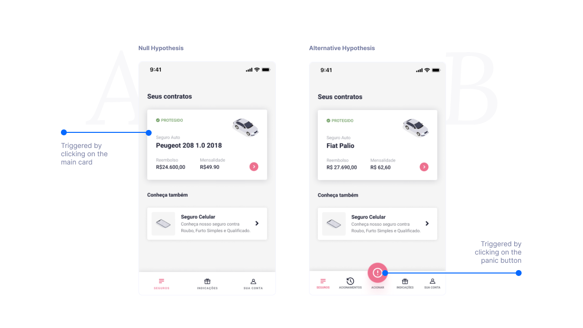

We applied a comparative chi-square test between these two hypotheses.
To trigger the car insurance using only the mobile app

We applied the test with 44 users for each of the hypothe
29,5%
26.5 seconds
58
29
10
5
29,0%
15.2 seconds
33
11
22
11
At the beginning of the project, we truly believed that the Panic Button would be a great solution. However, using statistical tests, we discovered that the alternative (B) solution wouldn't solve the problem and would, in fact, decrease the usability of the product. This type of insight prevented our team from wasting time and money building the wrong path, proving that the most cost-effective way to avoid wasted resources is to apply testing during the design phase. So, after these results we start to look for another way to solve the point.
With the results from the first A/B test, we decided to focus on improving the Car Insurance page, where the current trigger button was located for the user.
As an alternative solution, we redesigned the Car Insurance Page to focus on the trigger button. We made the page shorter and highlighted the most important part.

We reduced the page by 51.27%, making it easier for users to understand the content and find what they needed. Additionally, the redesign focused on keeping the user's attention on the trigger task.
We changed the bottom-sized position to one based on eye movement patterns on the screen.

29,5%
26.5 seconds
58
29
10
5
16
7s
84
40
2
2
The alternative version brought significant UX results. The A/B test helped us understand the right path to follow, avoiding the development of incorrect solutions and guiding us toward an improvement in all usability indicators of the flow. With this type of initiative, we can focus our resources (time, people, and money) on building what will truly make a difference for users, rather than betting on something uncertain.

The best way to save both money and time is to understand the potential impact before starting development

You need to understand the current state of the company; sometimes, you have to take risks and build

on't get attached to your first solution, instead, you need to question what you've built